Visualizing using the GraphQL IDE
Instead of displaying the data in a raw JSON format, you can present the data in a graphical format such as a Sankey diagram or a graph, making it easier to understand and interpret the information.
Here’s a sample video showing you how to visualize the Coinpath® flow using the GraphQL IDE:

Visualizing using Gephi
- To visualize the data in Gephi, first install Gephi on your system.
- Exporting the data: Open your GraphQL IDE and run the desired query.
- Select either “inbound” or “outbound” from the options provided to create a directed graph.
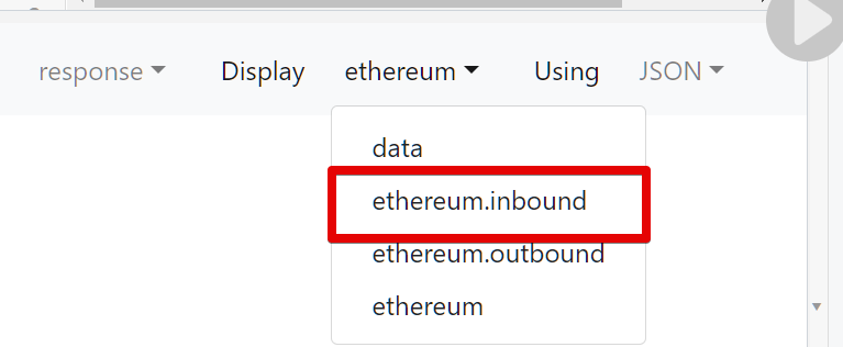
- In the data format dropdown, select “Table Widget.”

- Follow the video instructions provided for further steps on how to export the data for Gephi visualization.

Visualizing the data in Gephi:

Once imported, you will see the graph. You can set the graph to display or hide the labels (in this case, the address) and weight (in this case, the amount).

Click on any node to see the inbound transfers. The label on the edge indicates the amount that was sent.
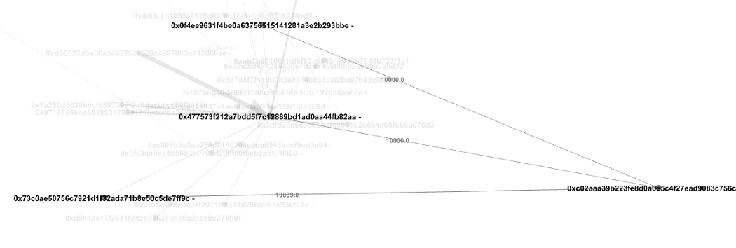
Play around with the visualization to understand token transfers, you can quickly identify patterns and relationships that would have otherwise been difficult to spot.